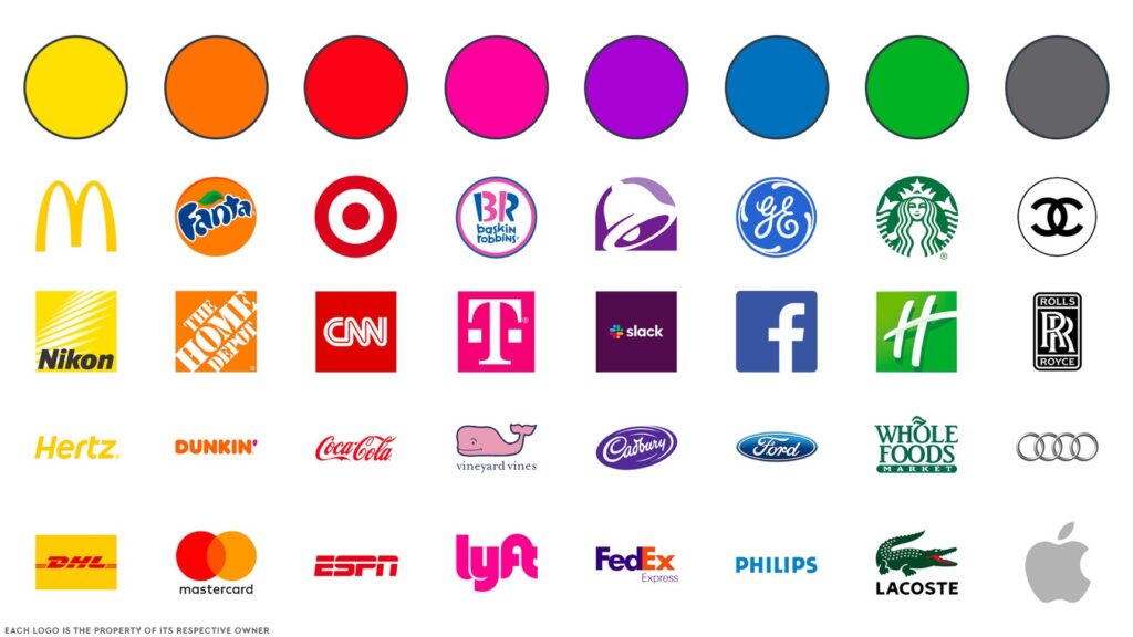
Using Color in Branding
We could—and many others have—write a whole book on the topic of color. From the physics to the psychology, there is much for a designer to understand about the use of color. Nonetheless, the most crucial thing to understand about color when creating a graphic identity may be when to make decisions about it.

Designers may be tempted to create with a specific color in mind because color adds such an instant emotive quality to a brand. Avoid giving in to this temptation. For every new mark, finish your original design regardless of the color or colors it will later adopt. You must make sure that a mark will function in several colors because most visual identities have color restrictions based on the application. Additionally, colors are frequently influenced by fads, so what is modern now could appear outdated tomorrow.
Nevertheless, a graphic identity can be made or broken by the color scheme. Even the best-drawn mark might be detracted by color choices that are excessively archaic, unreadable, simple, etc.
The inherent aspects of color—hue (red vs. blue), saturation (bright blue vs. blue gray), and brightness (light blue vs. dark blue)—should be your first consideration when thinking about color for a mark.
Review the color wheel and consider the visual trickery that complimentary colors with the same values can produce. Think about subtractive color, where all the colors combine to form white, or additive color, where all the colors combine to form black.
Recognize how a light shape on a dark field seems smaller than a dark shape on a light field to understand the context of color.
Applying Color to Your Brand
Consistency and meaning are crucial as color permeates a branding program into settings, packaging, websites, and more.
Color is used in fiercely consistent ways in strong identity projects. It’s crucial to pick the correct color because if you wind up with the wrong one, it can detract from your brand, but it’s also crucial to apply it consistently. Anything less complicates the emotional range that initially influenced the color selection.

Keep this in mind when you consider how a program is connected by a base color and its accents:
Light travels at the speed of color. The way the brain reacts to color is similar to how it reacts to pain or pleasure. It’s fundamental and instantaneous.
Before giving colors meaning in your identification program, be aware of their cultural connotations. In addition to meaning “go,” “green” can also refer to the Brazilian national football team or being ecologically friendly.
The Power of Brand Colors
Widely recognized ideas about color have been developed as a result of clinical and anecdotal tests on color psychology and emotion. For this reason, hospitals and schools like to paint their interior walls teal to create a calming atmosphere, while eateries tend to use red to create a hunger pang. However, the significance of particular hues varies over time and within cultures.

The impact of fashion industry trends on color selections is undeniable. In fashion marketplaces, seasonality leads to planned obsolescence. What is this season’s new “black”? Experts in color trends attempt to forecast the future automotive colors that buyers may desire. These color trends frequently and freely transcend markets. A well-liked lime-green accent on a Prada purse could end up on office chairs, websites, business cards, or interior design.
Color interpretation is also influenced by culture. The apparent example is that mourners in Eastern cultures wear white to funerals, while those in Western cultures wear black. Color’s cultural meanings are frequently ingrained in a market.
