Using Dimension in Your Brand
Although most graphic IDs are two-dimensional, many identity programs cry for the possibility of three-dimensional marks. When they do, intriguing risks and questions surface.

Should a spherically stylized emblem on signage truly turn into a sphere? What is the ideal side view of a logo? Is it more appropriate to view a logo with three horizontal bars as three cylinders or three rectangular blocks? Does the sign have a proper manifestation, or is it subject to artistic interpretation?
The question of whether a logo exists naturally as a representation of something or—given the chance—as the thing itself swiftly arises when one ventures into this area. We believe that this response is obvious. A symbol is a logo. Converting a logo into a sculpture runs the danger of making it difficult to understand as a symbol. However, alternative treatments might make things more interesting.
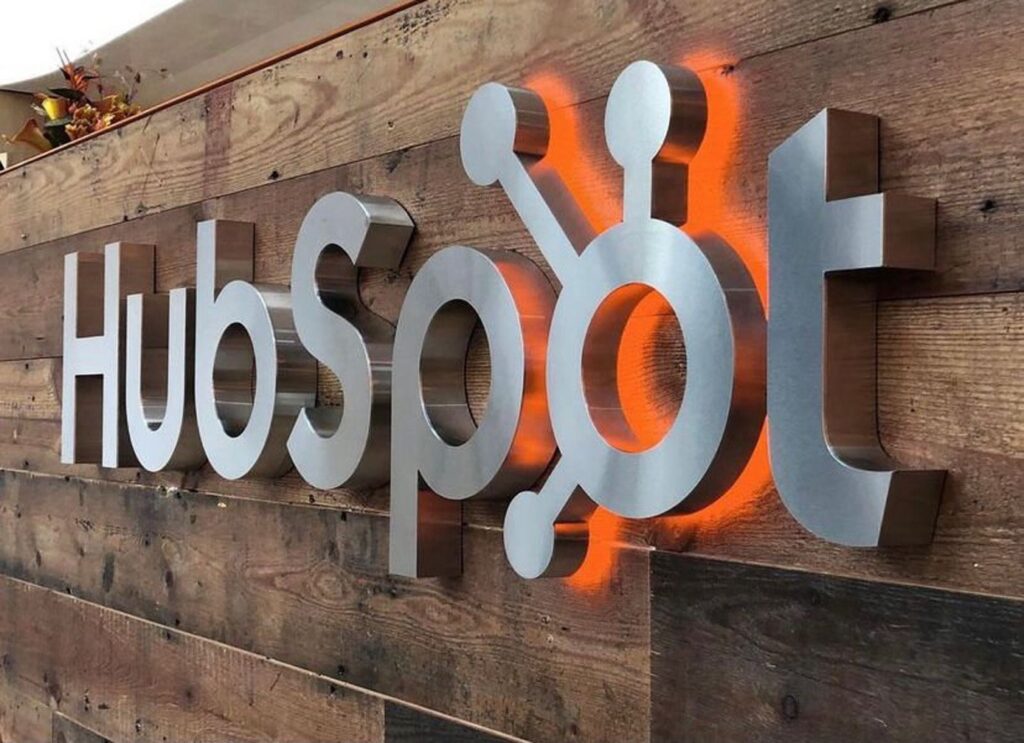
The significance of a mark is not altered by two-dimensional application techniques like paint or vinyl. Making raised, cut-out, or extruded shapes and letterforms is a common step in creating readable outdoor signage. If the thickness of the substrate improves the mark’s legibility rather than interferes with it, this method may be dependable.
Using Elements That Are Physical
Identity programs offer fantastic chances to enhance brand features when they expand into physical venues. Three-dimensional space allows for the sophisticated, unexpected, and enlightening realization of concepts that are implied in two-dimensional mark-translucency, shape, color, contrast, etc.

Effective programs use signage and interior and exterior architectural aspects to convey the brand’s identity or character. Although logos should be handled carefully, including other program components into a physical area is a great approach to develop a brand that goes beyond the logo. Readability, materials, scale, distance, closeness, atmosphere, wayfinding, and experience design are just a few of the numerous other variables, limitations, and opportunities that are involved.
Utilizing Interior Space
Program elements in a physical location blend together to create a unified image, much like colors on an artist’s palette. This presents a significant chance to develop an engaging brand experience.

In their business settings, the most prosperous retail chains and product showrooms are masters at developing distinctive, recognizable brand identities. Consider the ways that space, color, and materials combine to provide distinct customer experiences at Starbucks vs Victoria’s Secret or Costco. What is the size of the entrance door? What color are the walls? What is the ceiling height? What is the width of the aisles?
What is the product arrangement like? The cashier is where?
A five-star hotel, Central Park in New York City, an art gallery, or a corporate lobby are all excellent places to get inspiration when attempting to transfer a brand into a physical setting. Effective brand identities convey a feeling of location.
