Using Typography in Branding
Brand Monograms & Word Marks
Although many typographic games blur this line, monograms and word marks use words—usually the organization’s name or initials—rather than images to graphically symbolize an organization. Whether or not to employ a typographic logo should depend on the situation and context.

Type might work best when the objective is a mark that is unambiguous and straightforward. Naturally, if all of the competitors have done the same thing, that is nullified. You see? Background.
Word marks or monograms don’t require much interpretation from the viewer for the majority of corporations. For organizations with unique names, that isn’t the case. Customers are challenged differently by the Google word mark than by the Heath Ceramics word mark.
More options are available with a typographic logo than with an artistic one. As English has become the language of worldwide commerce, it is also making it harder for American enterprises to do business abroad. In an increasingly symbol-rich environment (do you not believe it? Look at the desktop of your computer.) A word mark can appear very neat, polished, and timeless.
Choices of Typography
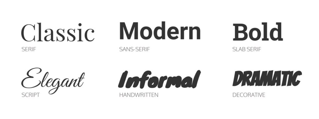
Personality is a feature of type. Selecting the appropriate typeface entails choosing one that gives your software the appropriate vibe. Serif vs. sans serif is the first decision. The pressure points made by a calligrapher’s hand gave rise to the thicks and thins of serif typefaces. Serif fonts are frequently associated with tradition because of that heritage. By contrast, the comparatively younger sans serif typefaces often connected with modernism. However, research shows that these personalities are in change. Around the world, signs systems have embraced sans serif fonts. Consequently, what was once considered to be distinctly modern can now be viewed as institutional.
The pressure points made by a calligrapher’s hand gave rise to the thicks and thins of serif typefaces. Serif fonts are frequently associated with tradition because of that heritage. The comparatively newer sans serif fonts, on the other hand, are associated with modernism. Evidence suggests that these personalities are changing, nevertheless. Around the world, signs systems have embraced sans serif fonts. Consequently, what was once considered to be distinctly modern can now be viewed as institutional.

When choosing a typeface, personality is a crucial factor, but it shouldn’t be the exclusive one. For an identification program, legibility, adaptability, and consistency are also crucial considerations.
Typefaces & Their Meaning
Although typefaces can vary, if typography is a significant part of a business’s identity, we can presume that the brand is appealing to readers who value prose or at the very least, catchy headlines. We expect kids to read, even if they may enjoy comic books just as much as a Shakespearean expert.
Similar to visuals, typography typically hints at a different meaning or cultural background for a company. In contrast to a typeface inspired by graffiti tagging on 1980s New York City subway trains, one that draws inspiration from vintage print advertisements from the 1950s would drive a company identity in a completely other direction.
Every typeface has a history of its own, which frequently distorts the meaning of the text. Although brand identities that include typographic components and visuals may require a little more of the observer than those that only use images, they frequently produce more profound and enduring memories. A headline and an image that complement each other are key components of some of the most successful advertising campaigns and promotions. For this reason, advertising agencies still pair writers with designers.
