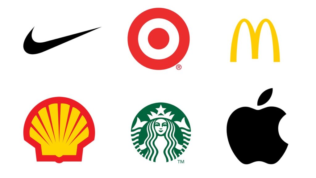
Using Shapes in Branding
A graphic identity is frequently made up of a collection of several shapes. At the same time, once assembled, graphic identities take on a single shape. Since other elements, like color, might alter over time or in different circumstances, a logo is primarily defined by its interior shapes. A graphic identity’s noteworthy elements can be the forms used and the way they interact: Are they freeform or contained? Is it simple or complex? Is it thin or thick? Does it have symmetry or asymmetry? Is it singular or multiple?

Many logos use a circle or square as their main outward shape in an effort to achieve a sense of balance or simplicity. The general form of a logo becomes a recognizable identifier for a brand, much like word marks that are recognized before they are read.
Using forms from a graphic identity to build program pieces can be highly successful.
Pattern or texture can be produced by using shapes that resemble the logo, such as squares for a square-ish design, circles for a circular logo, etc. In addition to improving the program’s overall appearance, these components can contribute to the graphic identity’s increased significance and memorability.
Program designers can add layers of meaning to enhance the identity program by translating a graphic identity into physical locations, which conveys more information. When these shape elements are used consistently, they will serve as a subtle reminder of the brand to the observer.
By reiterating or implying brand promises, identity initiatives can strengthen brand identities. Simple treatments could indicate that the product is easy to use. Patterns may point to customer service-related energy. Big, strong treatments are perceived by audiences as approachable, whereas subtle, little visuals may imply exclusivity. Additionally, shapes can be utilized to physically or figuratively depict a good or service. Shapes can reinforce one another to strengthen a brand identity’s meaning and tell a brand story.
